July 30, 2010

Downtime

Beach1

Beach2

Beach3

Beach4

Beach5

Beach6

Did you know that 71% of the Earth’s surface is covered by water. Yep, just a little more than 2/3rd’s. Good thing I know how to swim.

The writing used on these pictures is my own handwriting which I made into a font. It’s real simple to have your own font made. Just go to Your Fonts site, download their forms, write each letter out, then scan and upload your form. The font generator will create a .ttf file for you that you can load into your font folder on your pc. Oh, and it’s FREE! How cool is that?

July 29, 2010

Zentangles with Attitude

DoodleDirectory15

*most of the names of the above ‘tangles are from the authors, except where I didn’t think they applied.

I found the coolest Zentangle site thru Violette at her Creative Cottage. What a load of good tangle designs, really! You’ve got to check them out. I also like the way the site is organized and if you need to know more about a certain Zentangle, the author will link to a visual demonstration. Pretty kewl !

WaterBW

Now, look at the two of these identical scans, the only difference is the lower one had some Attitude applied. Which one is more interesting? Yeah, I think so too! The lower one is. I think it’s like that in life too, that the people who have just a bit of Attitude are more interesting. Heck, no one wants to be a door mat, and having a certain spunk doesn’t mean they are a snob. Now, I’m not saying snobs don’t have attitude, they just don’t know how to use it effectively! It comes off as mean. Then there are those people that are afraid of their own shadows and they’d just hate to think “someone thought, they thought, they knew what they were doing”….you know the type.

So, I think it’s like that with ART…..you gotta know when to use the RED and when to leave it well enough alone! Red is that POP, that makes us want to take that second look.

WaterC

Just some random thoughts, that may all change the next time I run into a Snob or a person with Attitude!

How do you use RED in your art?

July 28, 2010

Your Favorite Color

I was thinking a lot about color the other day and since I wasn’t inspired to “draw” anything (birds, people, doodle directory), I thought I’d do something simple and easy, but with lots of shapes I could color in.

image

I just measured out a bunch of rectangles and gave them a little dimension. Then I took a stencil and drew over the block series. I don’t know if you can tell, but the leafs have a different hue inside than the background blocks. Which is what I intended. This would be a better project for painting or those Watercolor Pencils, because then I could really adjust the hues accordingly, instead of relying on the marker selection of my stash. But, I like markers so this was fun!

image

So many colors, which one is your favorite? And….what does that tell us about you? For what it’s worth, I think we are far more complicated and can’t be defined in one to two statements. But this is harmless and fun, in the same way the Zodiac (your horoscope) is harmless and fun.

Here goes:

  1. WHITE: Purity, innocence and naiveté. Possibly a desire for simplicity or the simple life.
  2. RED: Strength, health and vitality. Red is often the color chosen by someone outgoing, aggressive and impulsive or someone who would like to be. Red is often chosen by people with open and uncomplicated nature.
  3. MAROON: It represents a well-disciplined Red personality. Someone who has been battered by life and has come through. They’ve grown and matured in the process.
  4. PINK: The gentler qualities of Red, symbolizing love and affection without passion. Maternal and protective. Pink people tend to be charming and gentle.
  5. ORANGE: Luxury and pleasure. A bit flamboyant and fun-loving but may have a tendency to over dramatize a bit.
  6. YELLOW: Happiness, wisdom and imagination. Yellow usually goes with a sunny and shrewd personality, with a good business head and a strong sense of humor.
  7. GREEN: Harmony and Peace. Green people can be too self-effacing, modest and patient, so they may get exploited by others.
  8. BLUE: Compassionate and Caring. Blues like to be admired for their steady character and wisdom.
  9. PURPLE: Temperamental, expansive, and Artistic. A Purple person may become aloof or sarcastic when misunderstood.
  10. BROWN: A Brown person has stamina and patience, tending to be very solid and substantial, conscientious, dependable, steady and conservative. Browns are not impulsive.
  11. BLACK: Dignified and impressive without being showy, Black people want to give the appearance of mystery, but their preference may also indicate a suppression of desires and worldly aims.

For more about what your favorite color says about you, click HERE.

Well, I don’t know about you but I see myself in about half of these definitions. Ahh, If only we could see ourselves as others see us. Or maybe not. LOL!

My favorite colors are Red, Green and Yellow. The full definitions of these colors are not me. Maybe at times, in certain circumstances, at different ages, on a holiday, when the stars are aligned, etc……Can I have 3 faves?

What’s your favorite color?

July 21, 2010

Graffiti: Is it Art or is it Vandalism?

image

I guess the answer to that question is whether the graffiti was invited? Whether it offends? Whether it helps add beauty to the spot?

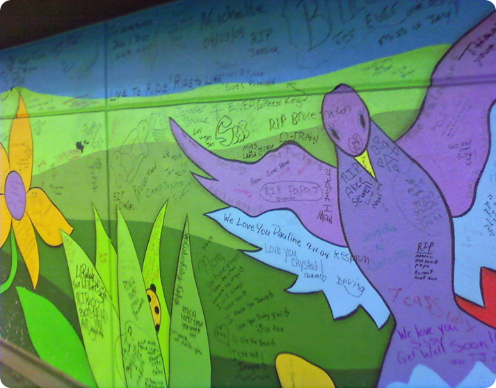
Here are a few pictures of the “graffiti” wall at the Hospital where I work. An artist was hired to paint a 100 foot span of wall on the inside of our parking garage back in 2003. Let me tell you, I love seeing this painting each day. Over the years, people have taken it upon themselves to personalize the wall. Which I think is totally cool, as long as there is no profanity or innuendo. Here is where patients have thanked their nurses or Doctors. The family has written prayers for healing. Widowed spouses have written love sentiments. Children have memorialized a parent or grandparent.

image

You’ll have to excuse the picture quality, these were taken with my phone.

image

As you can see, the graffiti here is really pretty special. Every now and then you’ll see a full name or a date. But mostly it’s written by the anonymous amongst us.

image

Not one profane word. I think this is similar to the playing of classical music in the roughest subways stations in New York. Then they see less crime there because the behavior of the vandals has been elevated, from hearing the classical music. Either the bad guys can’t handle “genius” in music and high tail it, or it speaks to the higher side of the would-be vandals nature.

Other than this wall, the only other time I’ll see graffiti these days is on the side of a box car of a train. I always watch the train go by because every now and then I’ll spot some real talent! And I always hope that the person behind it is using it…..using it for good.

image

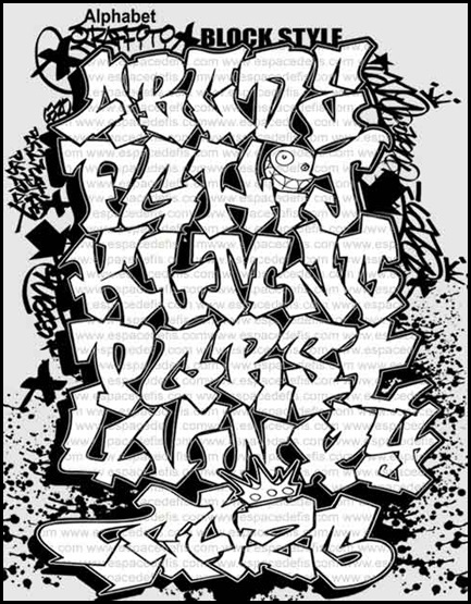
I found this alphabet on line. It looked like a simple enough graffiti for me to draw myself. Using my usual tools I proceeded to write out GRAFFITI in my moleskine. This was fun!! The only thing I wish I had more of was paper, got a little tight down there toward the “i.t.i”. I don’t do much word art. Probably because I have a very limited idea of hand-drawn fonts.

Graffiti-Alphabet-Blog-style

What do you think of Graffiti? Dare I ask, have you ever graffiti’d?

Related Links:

Graffiti Art

Graffiti Article

July 19, 2010

You’ve got to meet Robin….

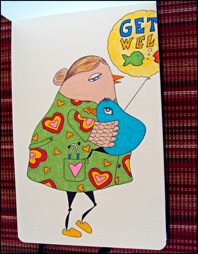
Robin- the Pediatric RN……She definitely has a calling for her profession. She shines in a crisis, you’ll see her very best come thru then. She has a way of putting everyone around her at ease during any storm. She absolutely adores the little people she sees everyday. She remembers the names of each of their favorite stuffed animals, their favorite foods and she shares many inside-jokes with the older kids. Why then has she quit 3 times since Christmas? Cuz each time she loses “one of her own”, she can’t take it! It’s her husband that has stopped her from actually saying “I Quit” each time. He knows she’s stronger than she thinks she is and sees how happy she becomes when her kids get better.

I will tell you right now, I am no Robin. I couldn’t do what she does. These people are the real unsung Hero’s if you ask me. They’ve seen it all. And they still get up each day and put on a smile as they enter the War Zone. God Love Them. Being really ill and then pulling out of it and finally feeling like yourself again, is no small task. Where would we be without the kindness of strangers?

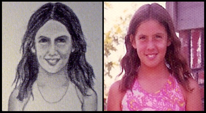
Whew! On a lighter note…….I want to show you the difference between the scan colors and the real thing. Hopefully you can make some sense from the picture below. Scans are wonderful for scanning old pictures but sometimes with these drawings, it just isn’t up to the task.

The skin & hair on Robin-the-RN just doesn’t scan well. It appears splotchy and too pink, as you can see from the image on the left. Aw well….such is life!

Once I get my basic drawing done….I’ll trace over the pencil lines with my favorite Faber-Castell Pitt black pen. Then I get to sit back and be a kid again, as I color away!

July 17, 2010

Foot fetish???? Hmmmmm….

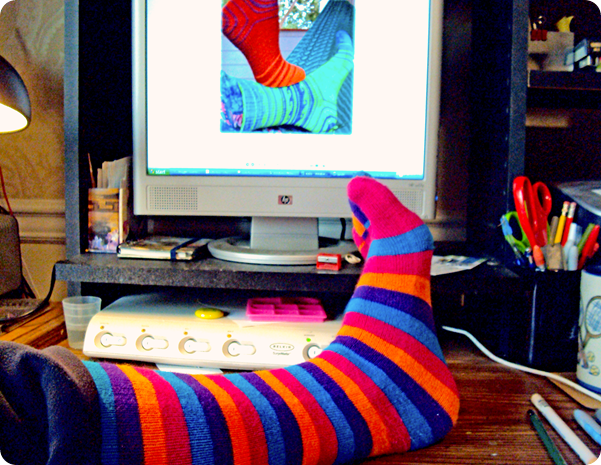
Actually…..it’s more like a Sock Fetish! And I’m not the only one, my daughter inherited it as well! I ransacked her sock drawer yesterday because I needed a striped sock. And look at all the goodies I found. It’s 95 degrees outside and I haven’t seen her wear any of these socks in months, possibly years. I don’t think she’ll notice they’re missing. If this were my sock collection, I’d have less pink and purple and way more reds,greens, and yellows….but that’s just me. Unfortunately, I’ve since grown out of my sock-mania- obsession.

image

As I said, I was looking for a striped sock, because I wanted stripes in my drawing not the funky pattern from the socks on the monitor. (Using creative license once again, to make things easier on me by replacing original sock pattern with stripes. Otherwise, I’d throw in the towel and be done with it). I must say, it’s a tad hard to draw in this position. Glad I was only concerned with the stripes at the heel though.

image

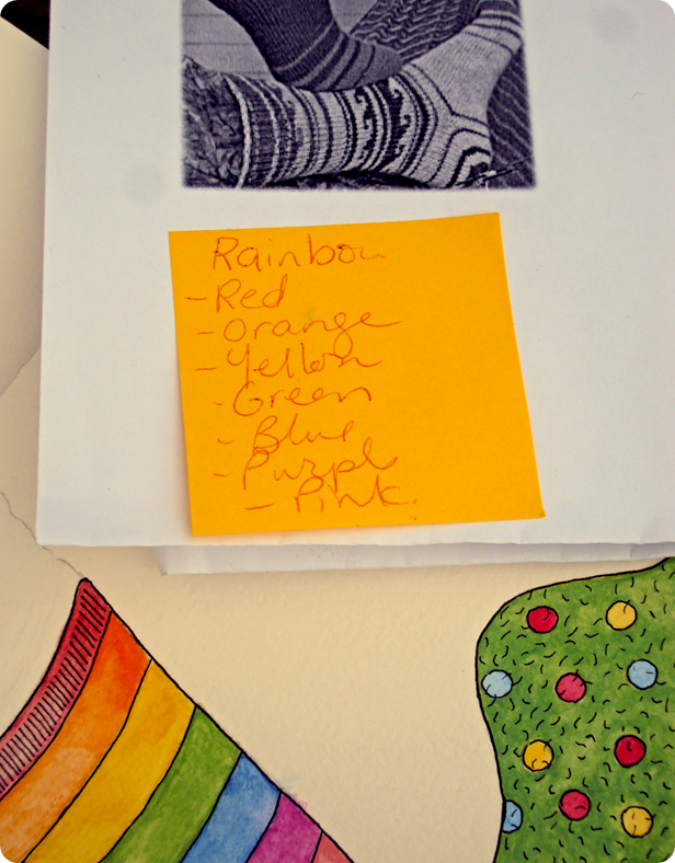
Made the stripes the colors I wanted, because it’s allowed (you know with that creative license et al). And for some reason, I can never remember the order of the Rainbow colors. Never!! If someone knows a pneumonic or rhyme to help….please share!

image

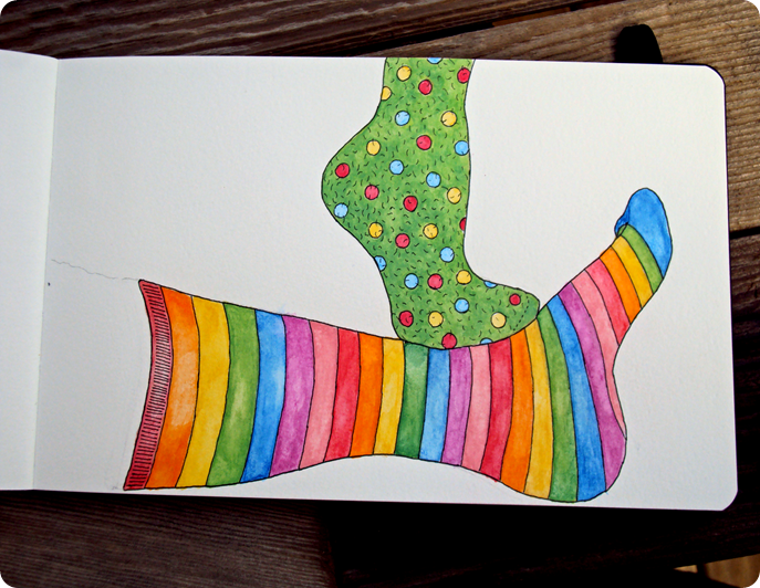
If you’re wondering what I used…..markers or watercolor pencils???? This was done with the watercolor pencils! Aren’t these colors vibrant? I am really impressed! At first, whenever I thought of watercolors, I always thought of those subtle, light, pastel colors….which I have to admit is a bit of a turn-off. But these colors, wow… they rock! Really! Very simple drawing, not much shading, cuz I don’t know how to do that with the watercolor pencils. Just a bit of highlighting, cuz I don’t know what I’m doing. Basically what this drawing was good for, was CONTOUR drawing. You know, getting the correct shape down on paper.

Again, I used my C-L (creative license) to make the socks longer, hence giving me more stripes to color in!! Ahhhh, pure heaven for the simple minded!

July 16, 2010

Word for the year


Oh No


Oh, No!! I just realized the year is halfway over and I never did get around to picking my word for the year. I had such High Hopes that I’d pick a really good word that would propel me to do more with my life….but alas, I forgot!

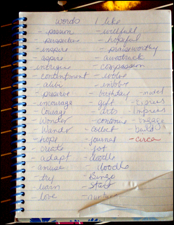
Look at this list….I’m surprised that none of these words resonated with me this year.


image

Last year I was one of the first on the word-bandwagon. My word, Start really got me off my duff to do some things, make some changes.

How about you? Did anybody pick a word? How has your word worked for you?

July 14, 2010

A Tie-Dyed Bird

Kristi

Kristi- the Chameleon……She figured out what her parents expected, did it….she figured out what her teaches expected, did it….her coaches, then her Boss. She’s an achiever, some would say an over-achiever. But this is the way she operates, she really likes to please and wants to help or be on the winning team. She’s smart, that’s for sure. Now, that she’s gotten older and has warranted a decent amount of respect, you’d think she’d be okay with that. But she’s a little lost because she’s not sure what she expects from herself, for herself right now.

I think we all know a Kristi or two. We often just look at them and think of what they can do for us. Which is totally understandable. Some people are born leaders and some are better at being lead. I think Kristi is of the latter group and there is nothing wrong with that. With a little time and maturity, these people figure it out. To be really good at something takes sacrifice, and a lot of it unseen. And how wonderful for these people to know that if they really want something, they have it within themselves to achieve it, learn it, do it! I applaud that amount of focus and discipline!

Enough about my life views, already!! Back to this drawing…..I really would like to do a watercolor tie-dye so I searched and searched on the web and didn’t find what I was looking for unless I want to tie-dye coffee filters or popcorn. BUT I did find this little instructional video about the various techniques for Watercolor Pencils. It’s a quick view, I think I learned a few things.

Here’s the daylight picture version of Kristi. The colors are better here. My scanner seems to have trouble with the lighter, pastel type colors. It doesn’t recognize them. I probably just need to go in a play with the setttings. But, grabbing the camera is so much easier.

image

Below, my entire bird family. Instead of clicking the links to see all the birds, I thought it would be fun to show them to you all together!

BirdsAll

Pic above looks a little squishy, don’t know what happened.

And to think, not one bird is exactly like the other! Ahhhhh, individualism! The foundation of America!

July 12, 2010

I splurged on this…..


 SONY DSC

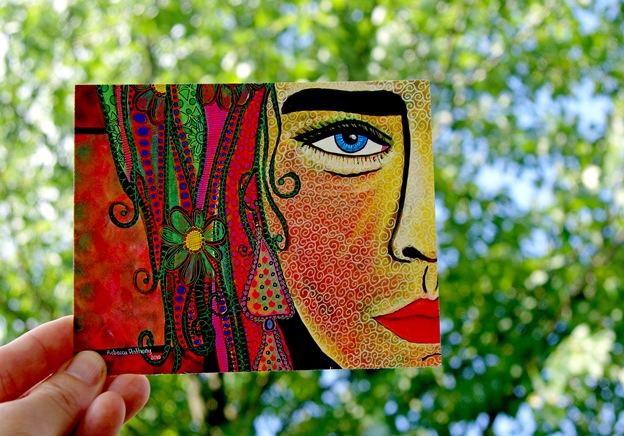
 Last week when Artist- Rebecca Anthony put her Daisydoll Goddess Postcards up for sale I had to get them.  These are the most beautiful, most colorful, most interesting faces I’ve ever seen.  It was hard for me to pick my favorite, but the one pictured above would be on my Most Favorite List, Most Viewed List, Most Colorful List, Most Interesting List….yep, all my lists, she’d be there.  I was astounded to realize that Rebecca does all this by hand, with her paints.  When I first came across her faces, I thought she had used some photo-editing.  But no, that’s not the case.  She just has a super steady hand.  I adore her use of colors.  Probably because she seems to be a big fan of REDS & GREENS….just like me! 

She has made some really awesome things from her Goddess series.  Hairbrushes, pendants, postcards.  You’ve got to see for yourself, check out her etsy shop at www.daisydolls.etsy.com

And for your viewing pleasure, more pictures of Rebecca’s Daisydoll Goddess postcards.

 SONY DSC

I thought they’d look real nice hanging from my Ikea Deka Curtain Wires that I have hanging in my studio.

 SONY DSC

As an added bonus, you’ve got to see the back of these postcards.  This is the blueprint, if you will, of her faces.  Such a cool feature for Rebecca to include.  Because after she’s painted all those layers, it’s hard to see how these Goddesses got started.

SONY DSC

Now, do you see what I mean?   Do you see what all of the fuss was about??

July 11, 2010

Part 6…. Watercolor Pencils

image

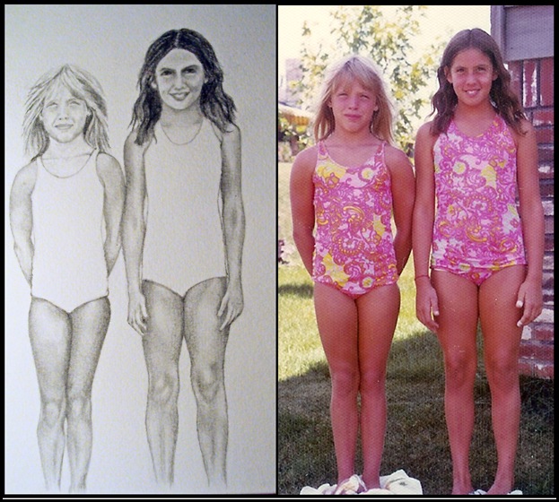
Finally got the guts to color in the suits of my sketch drawing! After doing a practice page, and playing with a pattern for the suits, I was ready. Since, I decided just to make the suits similar, not exact, this took a lot of pressure off.

I want to thank everyone who commented about what to use for the suits. Markers or Watercolor pencils? The majority voted for Watercolor pencils. I think the watercolor pencils turned out okay, lots more play in the pencils than with the markers. More blending ability. Too bad, I didn’t duplicate this picture and set aside one for markers! That would’ve been a fun comparison.

image

Thanks again for supporting me through the steps ( Friends, Procrastination, Progress, Knees & Elbows, Big Head) of this sketch drawing. It was fun, and I plan on doing another one sometime soon. Love using pictures for this.

July 10, 2010

Fore!!! Watch Out!!!

Had to draw a golfer-birdie because my Golfer-Auntie requested it. She’s been golfing as long as I can remember. And she’s pretty darned good.

I’ve screamed “Fore” quite a few times when I played golf. Actually, I didn’t really play it was more like a bunch of teens on the golf course goofing off. I don’t think we ever kept score and usually by the 5th hole we were ready to call it quits. Here’s what I found out about the meaning of “Fore”, whose exact origin is unclear. Again, you get your choice about which definition you want to believe.

  1. “Fore” means ahead so when someone yells FORE on the golf course they are telling the others to watch out ahead.
  2. As early as the 1800’s the term was used according to the British Golf Museum. Back then they used a forecaddie. Which is a person who accompanies a group around the golf course, often going forward to be in a position to pinpoint the locations of the groups' shots. If a member of the group hit an errant shot, the thinking goes, they may have alerted the forecaddie by yelling out the term. It was eventually shorted to just "fore."
  3. Then this last popular theory; which has a military origin. When artilleryman were about to fire they would yell "beware before," alerting nearby infantrymen to drop to the ground to avoid the shells screaming overhead. So when golfers misfired and sent their “missiles”, their golf balls screaming off target, "beware before" became shortened to "fore."

LeAnn2

LeAnn- the Lady Golfer……she lives for the weekend. At least she does now. She just started her own business and quickly found out that networking is the name of the game. So, she started taking golf lessons, which lead to joining the “Wednesday Morning Ladies League”. She can’t get enough of it. This surprises her, because she’s never thought of herself as athletic or competitive. But with golf, it’s different. She has met so many interesting people and truly enjoys getting to know them. She likes that the focus is on golf, not on “socializing”. When she’s out on the beautiful course with 3 other ladies how can she not take interest their lives? And to tell you the truth this activity is bringing her way more business than those “Chamber of Commerce” meetings. Who’d have thought?

Since I draw on the go, I don’t carry around watercolor pencils, brushes, or water. This probably would’ve looked better if I had used another medium. It would look excellent if I just filled in the grass by photoshop. But where’s the fun in that? The sky and hair were done with watercolor pencils. The scan is a bit disappointing, on the paper the sky doesn’t appear so splotchy.

One of these days I’m going to get smart and make my own stencil for these birds. I basically go off of the same standard shape, other than the legs, it’s a no-brainer. Putting this on my “to do” list.

Enjoy your weekend! And all you golfers out there, beware of the errant golf ball.

July 8, 2010

You have permission….

image

Yes…..You have permission to use stencils! Really! They get your mind off of your lines, and on to what exactly you want to express on the paper. Did you know that many professional fields use stencils? Drafters, Architects, Landscapers, Interior Decorators, and Graphic Designers. Graphic Designers use a digital stencil or stamp called Brushes. If you’ve ever loaded “brushes” into your photo editing program then you know what I’m talking about. Digital brushes can do so much more than the simple manual ones pictured above. They’re pretty cool and versatile.

Today’s post is in response to a comment from LuLu from an earlier post. She was so cute when she said,

“And thank you, thank you for giving us permission to use stencils - I have a whole stash of stencils that I rarely used - but now I will dust them off and use them more!”

Personally, I don’t think my “art” has suffered because I use stencils. I have found that my line drawing, my pencil grip have gotten better since I’ve taken to using stencils. It’s given me more confidence in drawing a straight line or a circle. The subtle or minor touches to a drawing have been enhanced because I’m actually spending time with my tools (pens, pencils, markers) now. I’m getting that practice in….who cares if I’m tracing over a stencil line? I’m not that proud... Well, maybe a little.

500px-Scheme_human_hand_bones-en_svg

Picture of hand from wikipedia.

NOTE: Since I tend to get my tarsals, metatarsals, carpals and phalanges mixed up, this picture just may help me remember them.

Did you know that the human hand has 27 bones? I found that out only because I really wanted to know how many muscles are in the human hand. I could not find this answer on-line. Anywhere! The articles I came across were all about the “muscle groups” of the hand. There was a lot of talk about the thenar, hypothenar, dorsal, volar and lumbrical muscles. Please……I just want a number, not an education. Was I going to be tested? Ugh! So, please if anyone knows the answer….. post, post, post. I really do want to know! Maybe there will be a prize????

My point is, that with all these muscles and bones, we really need to get our dexterity up to task. I think drawing, with or with out stencils helps with this. We don’t use our hands like we used to. Heck, with all the computer time I put in, my long hand has gotten super sloppy. Which means my ability to make my hand perform certain lines, marks and scrolls has suffered as well.
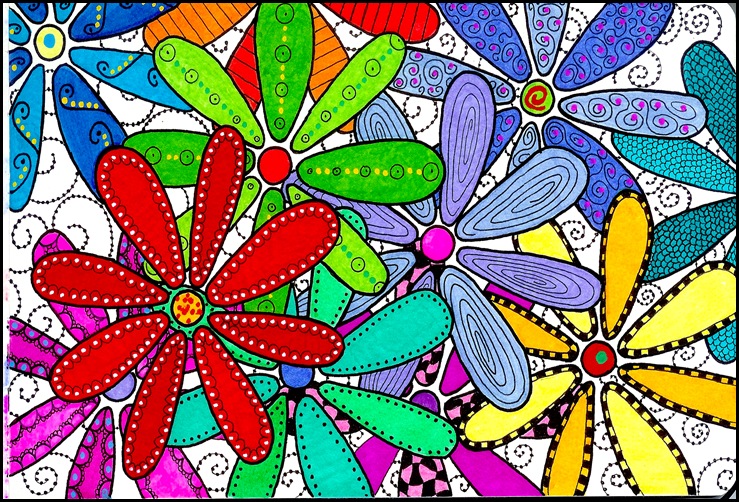
FlowerStencil

This flower power doodle is in HONOR of stencils! Go, get out your stencils, your markers, your paper. Use those phalanges and have fun! It’s okay!! Really, it is!

July 4, 2010

Part 5….The Big Head

Friends15

I’ve got a big head…Literally!! My heads are big here! Which reminds me of the Jurassic Park movie when the T.rex is after the people in the jeep and the camera pans to the side view mirror which says “Objects in mirror are closer than they appear”. Yikes!! Here it could read “Heads in drawing are larger than they appear in real life”.

Learned A LOT with this week-long drawing!

  1. Erasing is not as hard as you’d think. The graphite lead comes off very easy. Just watch out for smudging.
  2. Sometimes you just got stop and say “this is good enough for today”. I’m still training my eye and my hand.
  3. Familiar faces are much EASIER to draw. Can spot a line problem much earlier.
  4. Use a kleenex to help smudge the pencil streaks for shading or highlighting.
  5. Creative license can help to make people skinnier.

Friends17

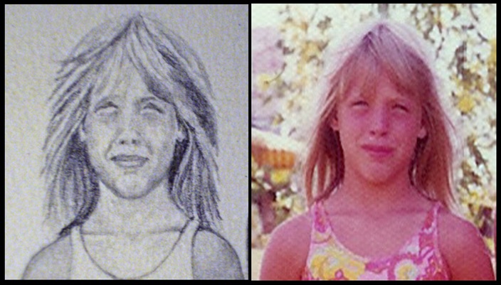
I thought I captured the eyes real well with this picture. The hair was fun, but not exactly what the picture showed. The head is too round and the chin still isn’t right. I never did go back and fix the shoulders. I was at my saturation point.

Friends18

Dark hair is hard to do. You’d think that it would be easier, but trust me there is a lot of subtle lighting in her brunette hair. The eyes were the most frustrating part for me. I kept drawing them too big. Again, the shoulders aren’t as broad as they should be. The teeth were not singled out, because it made the mouth look muddy. A sharper pencil may have helped.

This picture isn’t quite finished. I was thinking I’d attempt the matching bathing suits. But, didn’t know if I should go with Markers or Watercolor Pencils. Either way, I won’t be duplicating the pattern exactly (I’m no where near that level).

So, I’m gonna ask you…… Watercolor pencils or Markers for the suits? Please cast your vote in the comment section below!

Have a Safe and Happy 4th of July!

July 3, 2010

Craving Color

SONY DSC

I’ve missed my markers! What can I tell you? It’s two steps forward and then one step back here. My steps forward were actually using Graphite Pencils, my step back was running back to my marker stash first chance I got. Gotta have my color. My pretties! Pictured above are my Faber-Castell Brush tip markers! Love their vibrancy, their energy!

SONY DSC

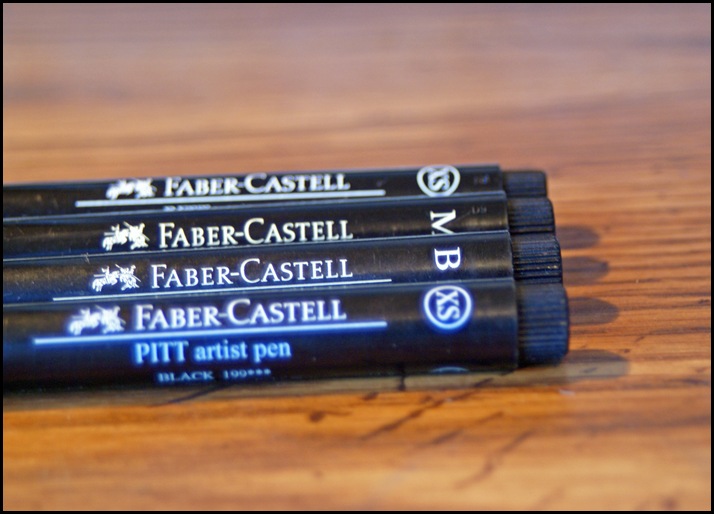
There’s not much that makes me happier than outlining with the standard black Indian Ink Faber-Castell PITT pens! I can trust them to do the job.

SONY DSC

I don’t use the Sharpie Poster Paints as much as I’d like. I tend to forget I have them. As you can see they are of the broader variety. A bit chunky to carry around in my little marker-case.

SONY DSC

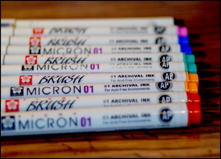
Talk about versatile! These Sakura Microns fit the bill. They have all sizes of nibs and a decent selection of colors. I only wish they sold them individually where I live because I tend to use one over and over. When the ink runs out I have to buy the whole set for just one replacement marker. I’ve only been in a few Art Stores that have their inventory set up to purchase these singly.

SONY DSC

Sharpie Ultra Fine Points…..they do everything and everyone has some. They are cheap and reliable. What more could I want?

SONY DSC

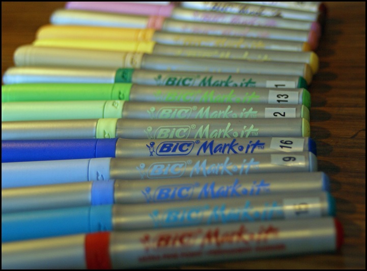
Bic Mark-its are another inexpensive & dependable marker. Staples will sell these individually but it’s not the ultra fine nib which I always prefer! Maybe someday they will.

Marker8

Here’s my little doodle’d Art Journal page for the day. A Mental Health Exercise!

Please tell me of other markers that you prefer. I’ve only got one COPIC marker, does anyone use these regularly? Are they worth the money?