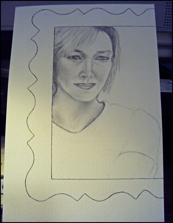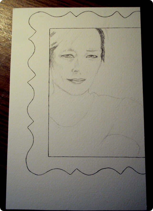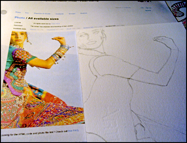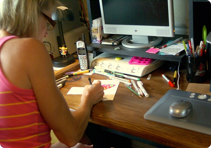
This isn’t the best picture of me….but then again, it isn’t the worst either. I thought I’d do a self-portrait sketch from this picture.
Looking at this image again after some time away, I can see that the head shape or angle to the viewer is not replicated well…..it’s too straight-on. It needed more head-turn angle.
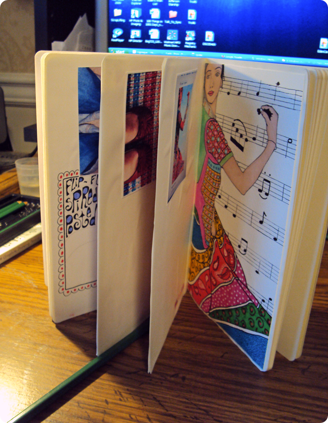
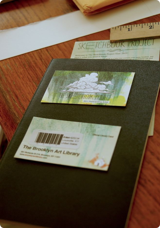
I found as the drawing progressed, it wasn’t looking like me at all. Then it dawned on me, I really didn’t have to make it look like me unless I wanted it to. I was free to draw any imaginary person I wanted. Hahaha. So what if it started off as a self-portrait, this is my book and I can do it my way. Plus, I do want to get this Sketchbook Project Moleskine done this year in a timely manner.
Took the sketching portion as far as I could before I started missing my markers. Used those wonderful stencils to add a floral decor to the picture frame. Then just started to doodle all over the place. That’s the fun part. The letting go of the analytical side and letting the right brain take over.
I doodled in the background with my Faber-Castell Black XS pen then gave the left edge of the frame a maroon bevel.
Now, I’m unsure where to take this next…….looks way to blank without putting something around the outside of the frame. I just read a letterform post from Lori over at Elvie Studio about lettering. She has a bunch of links to different styles of writing. I’m a willing student here, really…..but I’m in need of much instruction.
What do you guys think would look good in the background of this drawing? Ideas, suggestions, comments, complaints?


